Should I use Gamma or Beautiful.ai for an event deck?
How does screen size change slide design?
How do I keep a speaker from reading the slides?
“Your Slides Were Built for a Laptop. The Room is Not a Laptop.”
You build your deck where you build everything else: on a laptop, eighteen inches from your face, in a coffee shop or a hotel room the night before. Every design decision you make is correct for that screen at that distance.
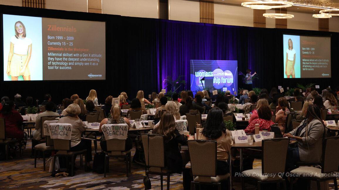
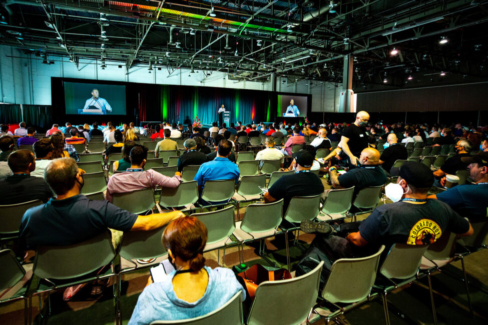
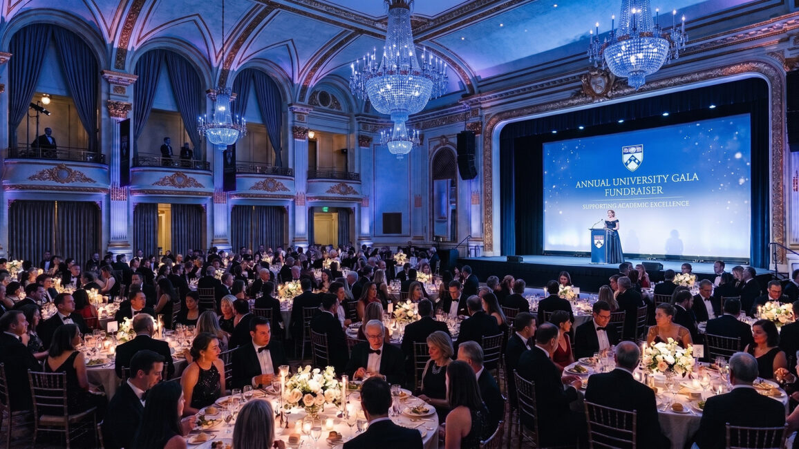
Then the file goes up on a wall the size of a garage door, in a room where the back row is a hundred feet away. Or onto a 32-inch monitor at a learning pod six feet from someone’s nose.
Same file.
Completely different physics.
Most event content is designed for the laptop and then projected, with fingers crossed that it can be read. That is the gap. The room you are standing in has rules your laptop hid from you.
Content design is not “make the slides prettier.” It is designing for the screen and the distance the content will actually live on. Get that wrong, and it does not matter how good the idea is, because the back half of the room cannot read it.
RUN THE BACK-ROW TEST BEFORE ANYTHING ELSE
Here is the only readability check that matters. Shrink your slide to a thumbnail. If you can still read the main point at that size, the back row can read it on the screen. If you cannot, neither can they.
Rules that survive contact with a real room:
One idea per slide. The wall is not a document. If a slide needs a paragraph, it is a handout, not a slide.
Text big enough to read from the back. As a working floor, keep projected body text around 24 to 30 points and headlines well above that.
Real contrast. Light gray on white looks elegant on your laptop and vanishes on a washed-out projector or a sunlit room. If you squint at your screen and the text gets hard to read, it will disappear in the room.
Cut the word count, then cut it again. The room is reading and listening at the same time. Give them one of those jobs.
Watch your animations. Subtle transitions that look polished on a laptop can stutter or blur on an LED wall. If it is not essential, cut it.
DESIGN FOR THE CANVAS YOU ARE ACTUALLY ON
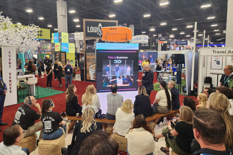
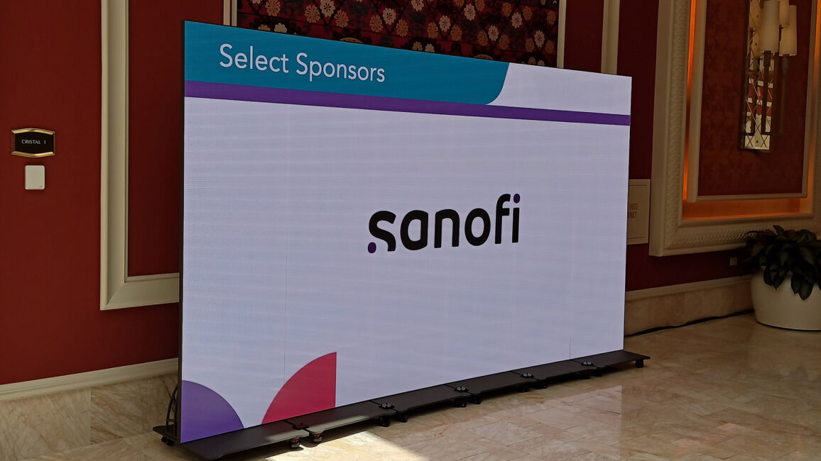
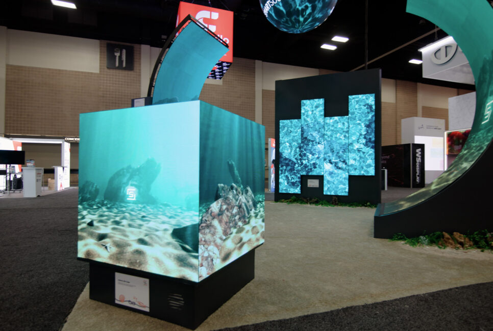
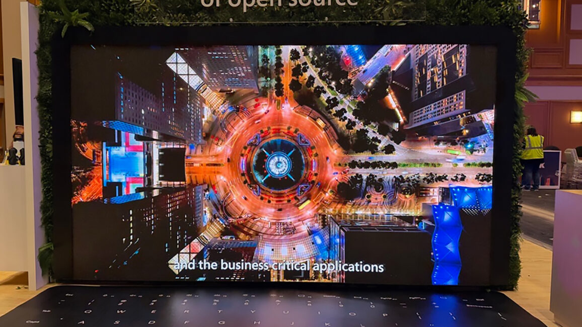
A 16:9 deck stretched across a 21:9 LED wall leaves you with two dead columns or a distorted mess. A deck built for a stage wall looks lost on a small pod monitor. Before you design a single slide, know the screen: a single 16:9 projector, a wide LED ribbon, dual flanking screens that may show the same content or different content, or a small monitor seen up close.
Build to that canvas. If you are running multiple screens, decide early whether they mirror or extend, because it changes how every slide is composed.
When in doubt, ask the AV team for the screen spec before you open a blank deck. That one conversation saves hours of rework.
THE TOOLS, AND WHEN TO SKIP THEM
The fastest way to a room-ready deck is usually not starting from a blank slide. Basic PowerPoint and two other tools come to mind, and they are good at different things.
Gamma is built for speed and motion. It shines when you need a modern visual backdrop fast, the kind of light, moving frames that suit a fireside or a keynote where the slide supports the speaker rather than carrying the data. It is not where you put a dense financial table.
Beautiful.ai is built for structure. Its templates auto-format as you add content, which keeps a deck consistent and on-brand, useful when a whole team is producing slides and you need them to not look like ten different people made them. The tradeoff is that template-driven decks can start to feel the same.
PowerPoint is built for flexibility and control. It gives presenters complete ownership over layout, animation, data visualization, and branding, making it the go-to choice for executive presentations, sales pitches, and content-heavy decks. If you need custom charts, complex diagrams, or slides that must precisely match brand standards, PowerPoint remains hard to beat. The tradeoff is that great presentations require more design effort, and without clear guidelines, decks can quickly become inconsistent from slide to slide.
Here is what none of the tools tell you: sometimes the best content design is fewer slides, or none.
A tool makes the slide faster. It does not make the slide necessary.
If the moment is a real conversation, the strongest visual choice might be a single image, or a dark screen and a spotlight.
THE SLIDE IS THE BACKDROP, NOT THE SCRIPT
The most common content failure is not ugly slides. It is a speaker reading them.
When the slide carries the full sentence, the speaker becomes a narrator, the room reads ahead, and everyone tunes out.
Build the slide to support the person, not replace them.
A few speaker-facing rules:
One idea per slide gives the speaker room to actually speak.
Put the detail in the confidence monitor or notes, not on the wall.
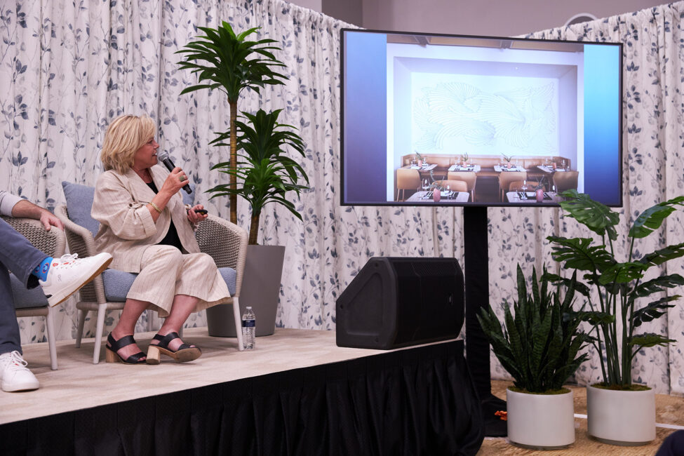
In a camera-first room, rehearse to the lens and trust the confidence monitor instead of turning to read the screen.
Rehearse on the real screen in the real room if you can get access. A slide that works on a laptop and fails on the wall is a problem you want to find at 2 pm the day before, not at 9 am on show day.
DESIGN FOR THE ROOM, NOT THE RECAP
Your content does not live on your laptop. It lives on a specific screen, at a specific distance, behind a specific person, in a specific room. Design it for that, and the same idea that died in the back row starts landing in it.
Want the numbers in one place?
Grab the Room-Ready Slide Spec, a one-page cheat sheet of font sizes, contrast, aspect ratios, and word limits by screen type. Pin it above your desk and design to it.
Big enough to read from the back row. A practical test is to shrink the slide to a thumbnail; if the main point is still legible at that size, it will read on the screen. For projected decks, keep body text around 24 to 30 points as a floor, with headlines well above that, and favor a single idea over a paragraph.
Should I use Gamma or Beautiful.ai for an event deck?
They suit different jobs. Gamma is fast and motion-friendly, good for visual backdrops where the speaker carries the content. Beautiful.ai is structure-first and keeps a team’s decks consistent and on-brand. For dense data or a one-off hero moment, sometimes neither is the right call, and a single strong image works better.
How does screen size change slide design?
A lot. A wide LED wall, a single 16:9 projector, dual screens, and a small pod monitor each have different canvases and viewing distances. Designing for the wrong one leaves dead space, distortion, or text nobody can read. Confirm the screen and the aspect ratio before you design.
How do I keep a speaker from reading the slides?
Build slides that cannot be read like a script. Limit each slide to one idea, move detailed notes to the confidence monitor, and rehearse so the speaker talks to the room rather than narrating the wall.